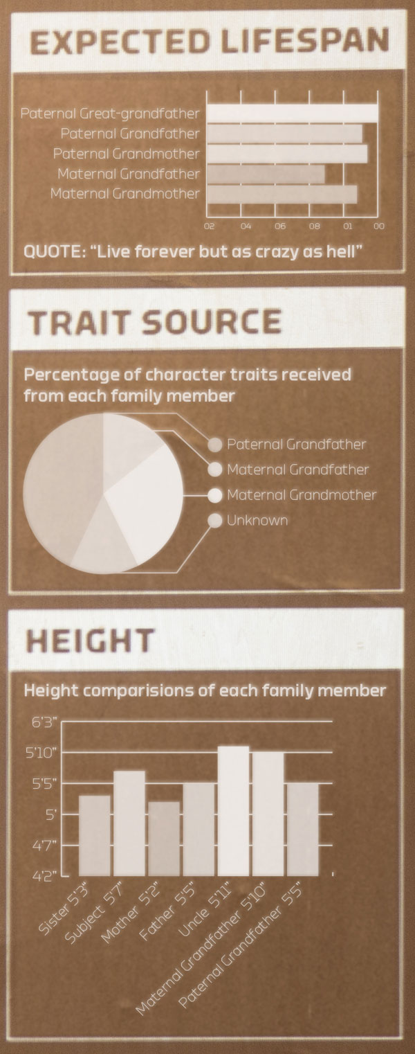
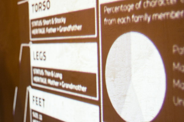
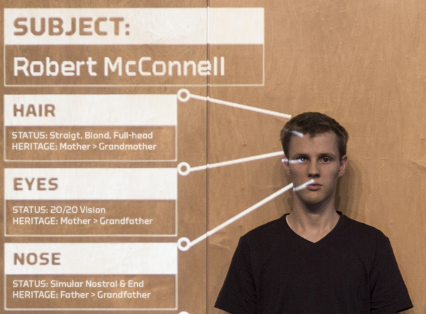
Personal Breakdown / A break down comparison/dataviz between myself and my fellow GD MFA classmate Ben. The dataviz was produced using photography to create a realism that many dataviz projects can lack.
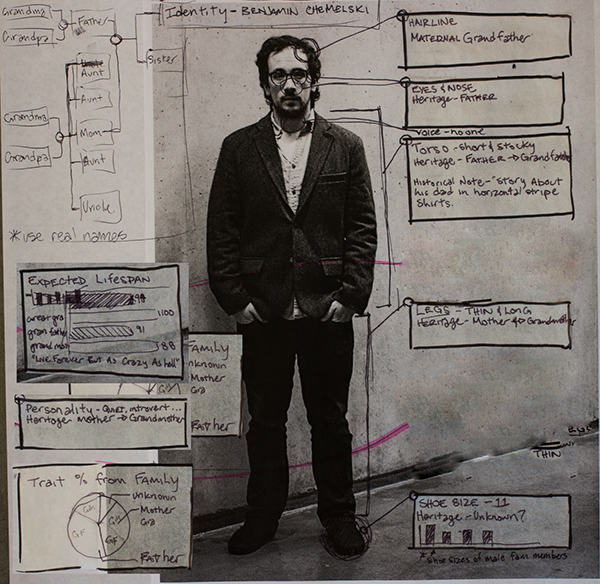
Next, the data layer was created in Illustrator. The info was projected on a wall and Ben posed again while the lines and alignment were finetuned in Illustrator to get the best match.
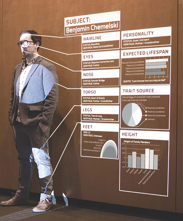
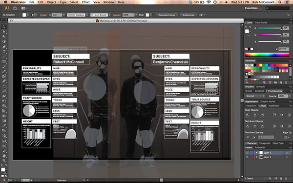
Then I took it a step further and did a cross comparison between both of us. I edited some details back in that were lost in the process to get the final piece.

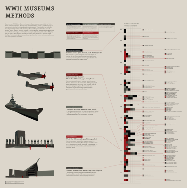
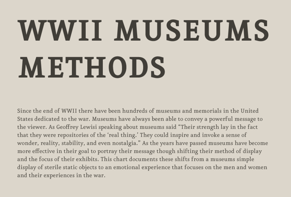
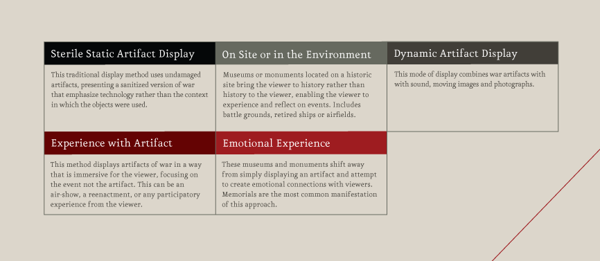
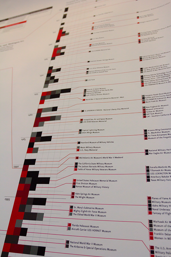
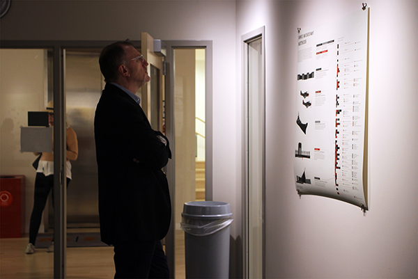
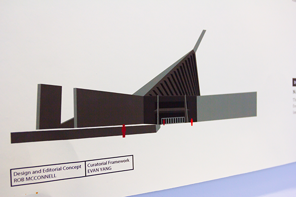
WWII Museums Methods / A collaboration project with a student from MICA's Curitorial Practice MFA. A 40x40 inch dataviz poster was created showing the shift in display methods that WWII museums and memorials use.


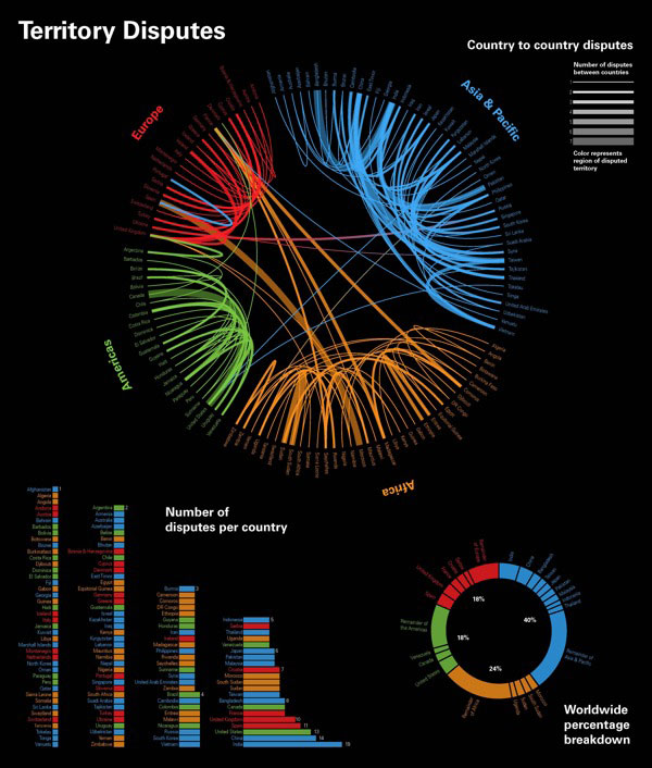
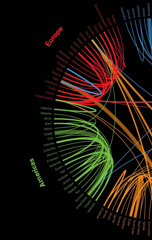
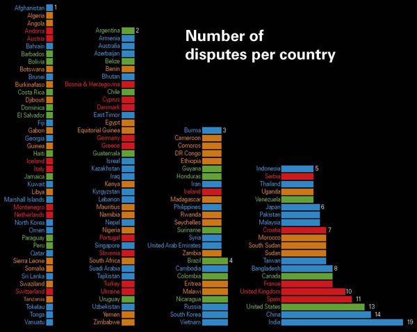
Territory Disputes / This infographic illustrates current territory disputes between countries worldwide. It was created to highlight the number of disagreements that still exist between countries with claims from land to water passage rights.
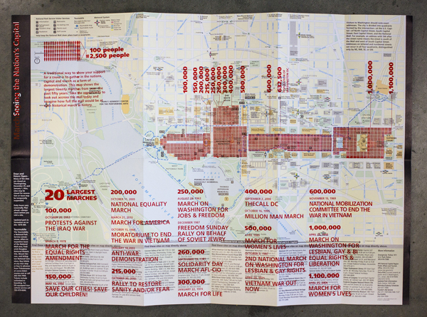
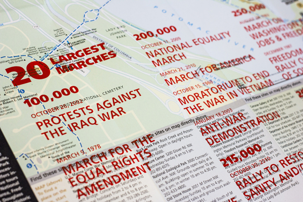
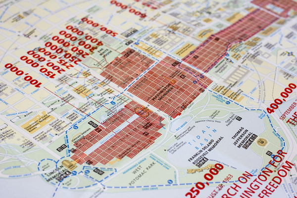
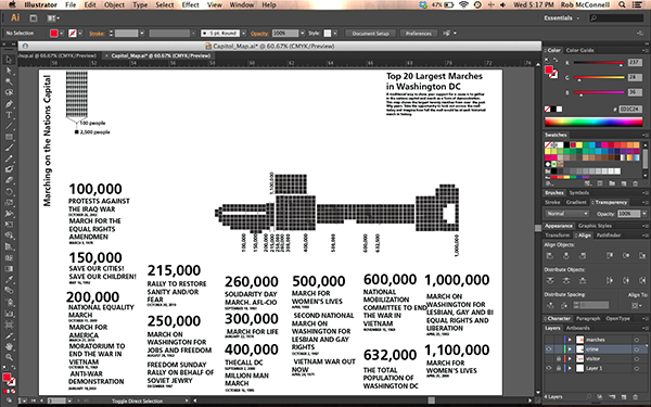
Top 20 Marches / Dataviz that shows the 20 largest marches in the National Mall. Screenprinted over the Nation's Capitol National Park Service Map. The map was used as a vehical to target those that would be in the mall at that moment so they would be able to make comparisons on how large and crowded the mall would be at these historical marches. I like the idea of taking a printed example of a dataviz (the map) and using it as a base for my own set of information that I want to portray.
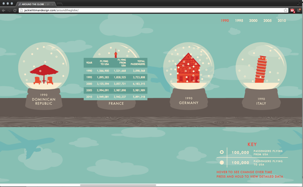
Around the Globe / Around the Globe is an entry to the Visualizing Marathon held by Visualizing.org in November 2012. Three fellow Graphic Design MFA students and I put our heads together and created this fresh take on flight data in 24 hours. Follow the link below to view the infographic live. View Infographic
